 Window Managers
Intro
Your window manager is the most crucial component in determing how your computer "feels". These programs define how you interface with "windows" on your computer. They can allow you to drag, resize, and re-screen windows. They also "decorate" your windows with a title bar, border, indicitive mouse cursors, and more.
Getting GNOME'd
This WM has become the standard for modern linux systems. If you see a linux computer, chanses are it is running GNOME for the WM. It presents as a well-designed, highly-polished system visually. However, in my opinion, GNOME's user experience is unsatisfactory.
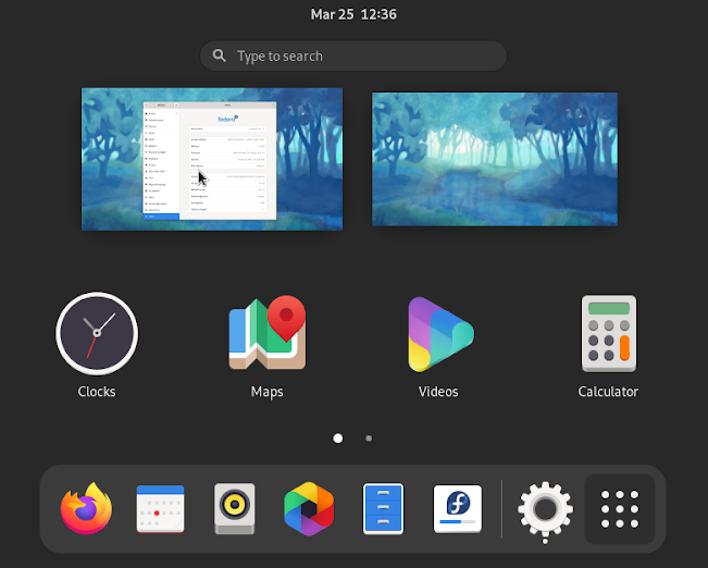
- title bars are huge (this 2x size change was my initial inspiration to look for alternatives)
- snapping windows is inconsitent
- configuration is done through 3+ guis
- extensions end up causing crashes on every update
- transition animations take too long and create screen tear
- ... and the list goes on
Popular Alternatives
Here are the first couple WMs I tried when starting my switch off GNOME.
Xfce
This WM is consistent, but feels rough and unpolished, especially if you are comparing from GNOME.

Almost every input in Xfce is slightly misaligned or mispadded. Also, their application menu (not shown here) has terrible icons and an even worse input field. The screenshot on their own site is so badly doctored that it looks like the screen is tearing!
I'm glad this WM exists as a competitor in the space. But, it provides too many unpolished features for my liking.
Plasma
Like GNOME, Plasma is trying to provide a "windows-like" experience with start menus, task bars, desktop apps, and more. It feels more polished than Xfce, but many interfaces are layed out in a non-standard way which, to me, made it an unnatural switch.
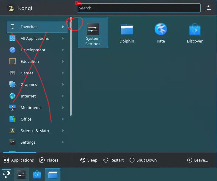
The start menu search is on the top and has an annoying box highlight. Secondly, the "groups" on the left serve to hide an otherwise excellent spot to put a consistent list of apps (like in Windows' start menu). Most people don't use enough apps in their day-to-day to need an arbitrary categorization system like this anyway. Further, there are so many groups that it needs a scroll bar to get to them all! At least in its current form, I would take GNOME with all of its quirks over this alternative.
Do-Less Alternatives
The window managers described above all try to behave similarly to a Windows system. This is great for on-boarding people to Linux. However, this design principle causes each to suffer from similar problems to windows. For example, GNOME is difficult to configure since it does not have a central interface for configuration. Xfce does not offer enough UI flexibility to create universally polished apps. Finally, Plasma appears to suffer from an interface engineered by too many cooks.
Fortunately, there is a solution to this problem - do less. Or, from Dong McIlroy, "do one thing well", and "don't insist on interactive input". The window managers described below mitigate these design problems by providing fewer features and requiring configuration in files, rather than GUIs.
AwesomeWM
AwesomeWM has some great looking screenshots available on youtube.
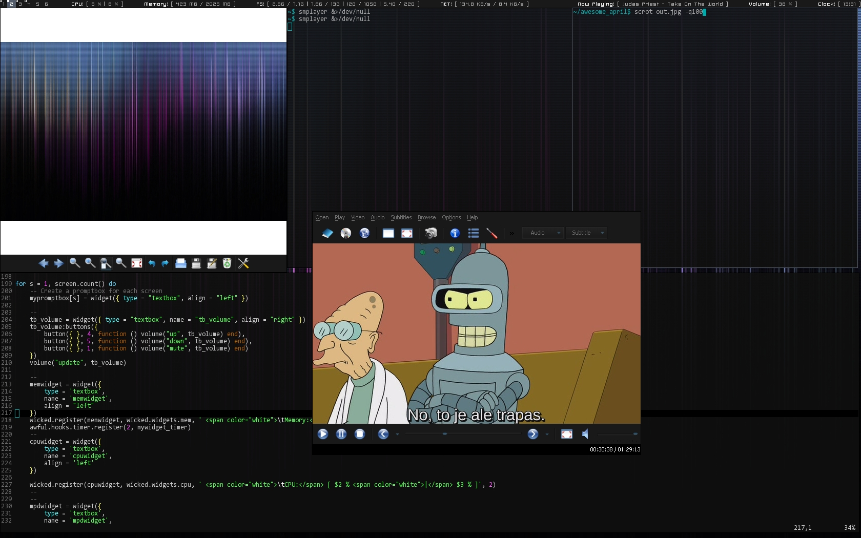
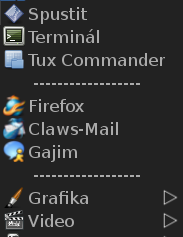
However, many of these screenshots omit its terrible looking start menu and right-click dialogues:
Lastly, I found its configuration difficult to learn which made it hard for me to tune to my liking.
i3wm
i3wm also has some appealing screnshots to consider.
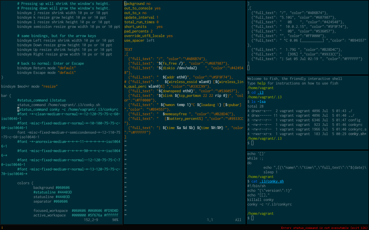
Once I got a configuration that I was happy with, I started to like this WM. Although, it was hard for me to wrap my head around the "new window direction" feature. Further, I think the direction indicator that you need to make this feature usable adds annoying UI clutter.
I used i3 for a couple months before the "split direction" got too annoying and I had to switch back to GNOME.
dwm
During one of my arch reinstalls, I decided to take the full plunge and try out dwm.
dwm's default look is comparable to i3's but it is noticibly harder to get started with. "blah blah" suckless software.
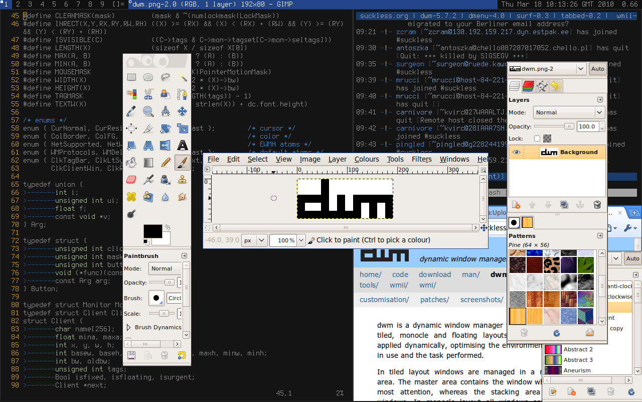
In my opinion, the primary advantage dwm has over i3wm in that you no longer need to care about which "direction" you are splitting since everything handles as part of a "stack".
Also, I found configuring dwm through patches to be somehow less confusing than trying to learn how i3wm/awesomewm's configuration files worked.
It took a month or so to get used to the keybinds. Since then, I have been very happy with the versatility and simplicity of the dwm platform. It is very easy for me to customize each aspect of my display from adding bar blocks to changing hotkeys. And, since it's tiling, it's easy to get perfectly aligned windows!
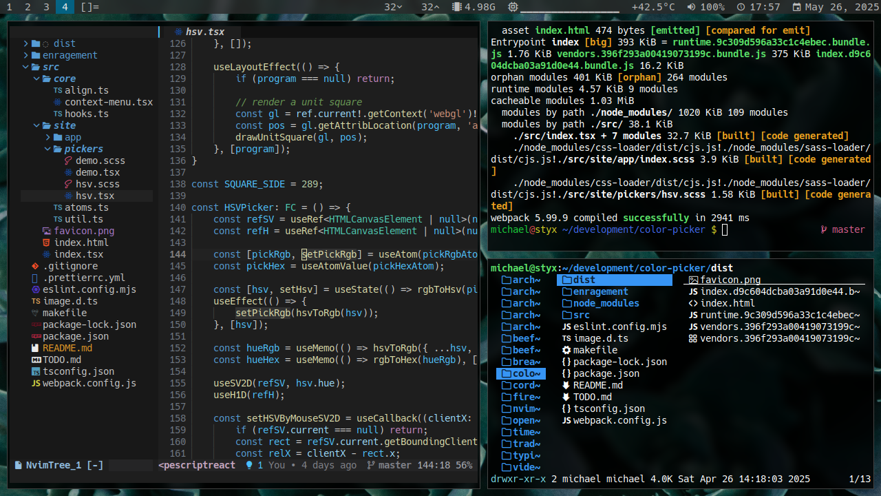
If you are willing to learn how to set it up, I suggest trying out dwm for yourself. It's been my daily for 4 years and counting.